Data grids#
Many pages in the Nokia EDA GUI display lists of featuring rows and columns of data. The options described here for managing such data grids are common to most data grids in the Nokia EDA GUI.
Note
Some lists include special options uniquely available for lists of particular data. Those options are described in the topics pertaining to those lists.
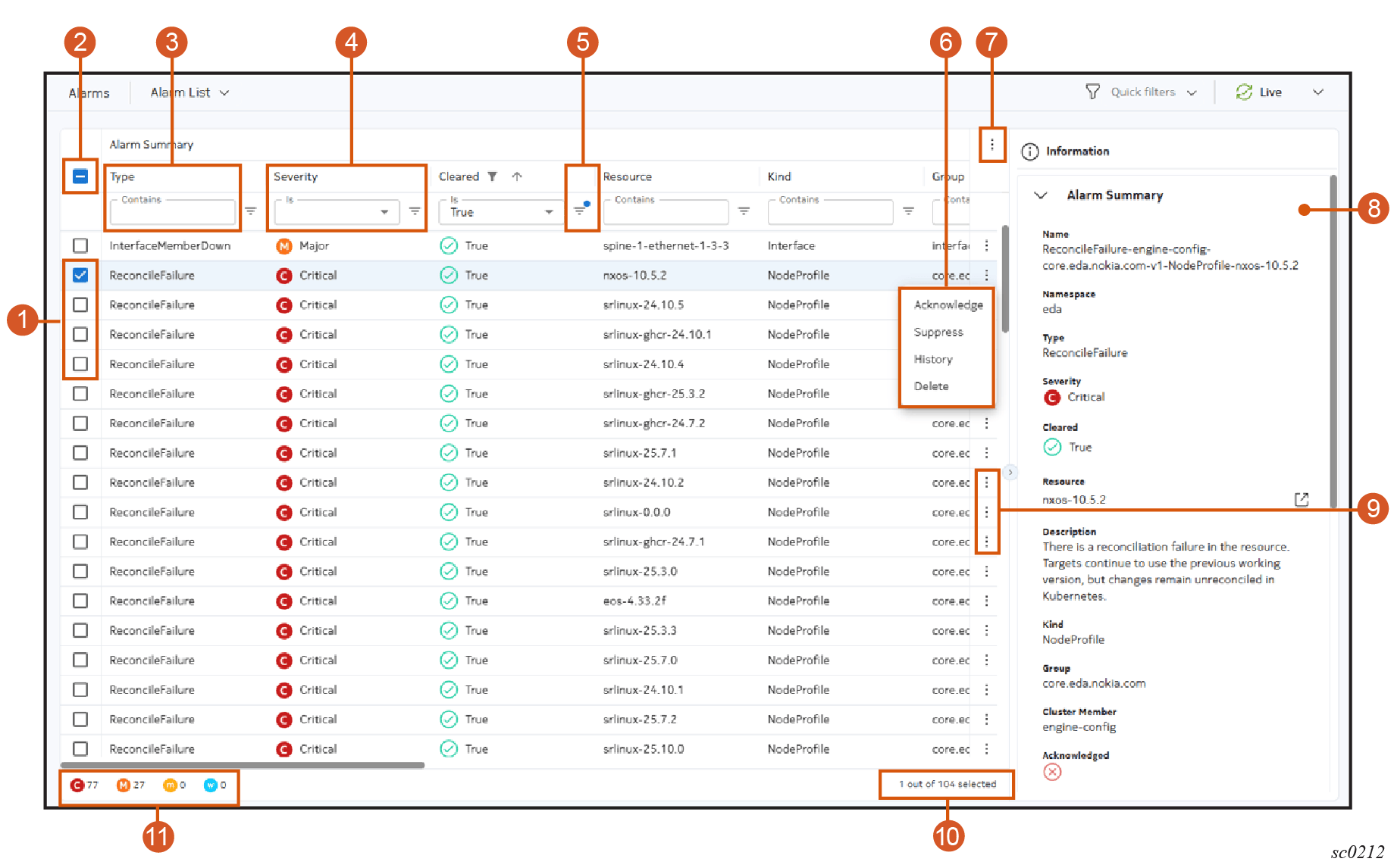
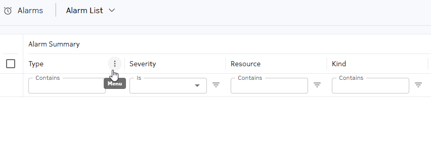
Table: Data grid controls
| # | Name | Function |
|---|---|---|
| 1 | Row selectors | Use these to select one or more individual rows. Note: You can use the space key to toggle the focused (active) check box in the row. |
| 2 | Multiple row selector | Use this to toggle between selecting all rows, and un-selecting all rows. |
| 3 | Text string filter | Enter an alphanumeric string to filter the list based on matching values in that column. |
| 4 | Selection filter | Select a value to filter the list based on matching values in that column. |
| 5 | Filter Applied indicator | When a dot is superimposed on the Filter icon, this field is currently applying a filter to the displayed list. |
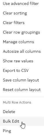
| 6 | Table settings and actions button | Click to open the menu of standard table actions, as well as the list of multi-row actions available for this table. |
| 6 | Table row actions | An example of the actions menu that is displayed after clicking the Table row actions button. |
| 7 | Table settings and actions button | Click to open the menu of standard table actions, as well as the list of multi-row actions available for this table. |
| 8 | Information panel | Like other pages in Nokia EDA, this panel displays detailed information about the selected object – in this case, the row or rows that are selected in the data grid. |
| 9 | Table row actions button | Click to select from a set of actions specific to the data in that row. |
| 10 | Row and selection counter | Indicates the total number of rows, and the number of rows that are currently selected. |
| 11 | Category counter | The Alarms data grid shown as an example includes an indicator of how many alarms in the full list belong to each severity category. |
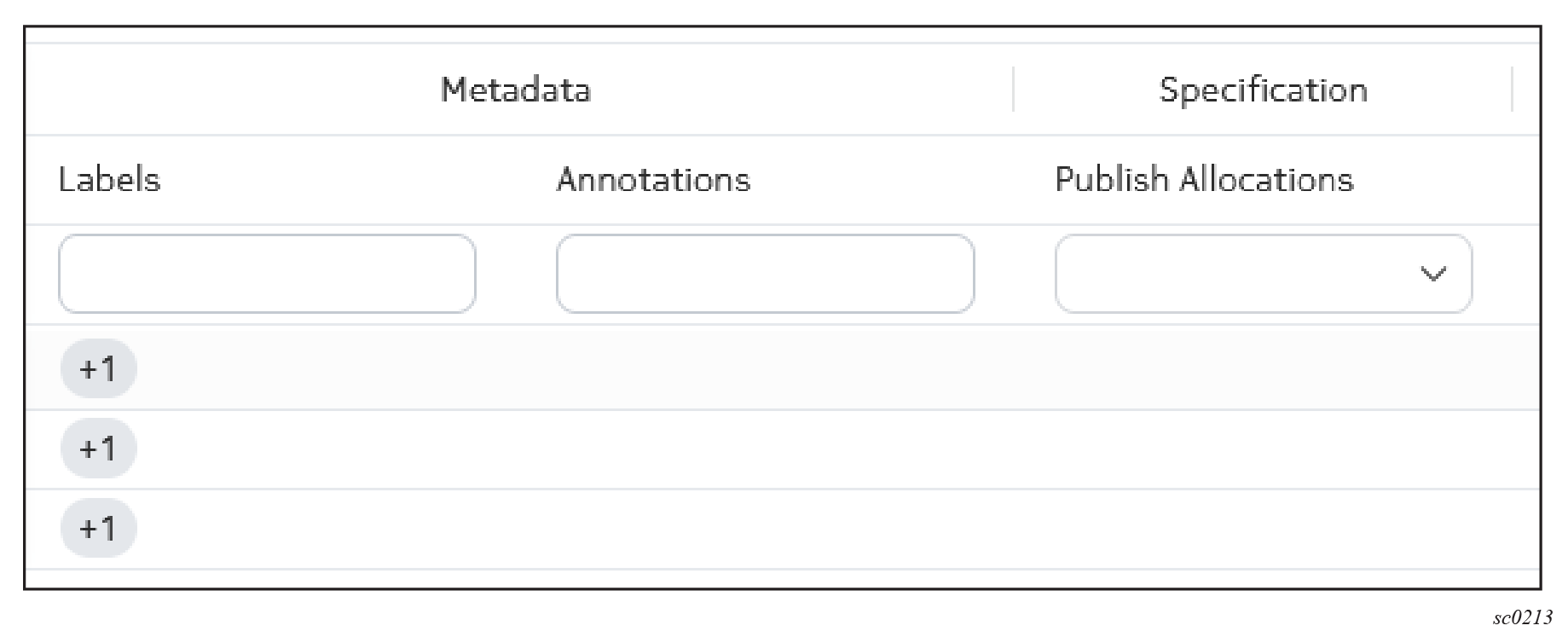
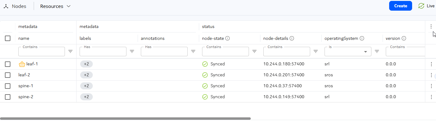
Nested columns#
Columns may be collected into groups; in this case, individual columns are nested within a higher-level column for that group. For example, several columns pertaining to resource metadata are nested within a Metadata column.
Managing displayed columns#
For any table, you can select which columns are displayed and which are hidden from view.
In the list of standard table actions, click Manage columns to open a Manage Columns dialog. This dialog lists all available columns; those checked are included in the data grid, and those unchecked are excluded. By default, some possible columns may already be excluded from view.
Select or un-select the available columns and click Apply to close the dialog and update the data grid display based on your selections.
To rearrange the position of a column, click the column header and drag it to its new position.
To restore the default configuration for the data grid, click the Table settings & actions icon and select Reset Column Layout from the action list.
If the set of columns exceeds what can be shown at one time in the display area, the Nokia EDA UI adds a scroll bar to the bottom of the data grid. Scrolling horizontally moves all columns to the left or right as you would expect.
For most data grids, the Name and Namespace columns are pinned to the left by default. When scrolling horizontally, these columns remain visible at the left edge of the display.
Dynamic display for namespace column#
Many data grids include a column for Namespace, which identifies the particular namespace associated with each row.
However, if you have selected a single namespace in the Namespace selector on the top bar, then the Namespace column is automatically hidden on the data grid. Because all namespace values would match the selected namespace, displaying the column is not useful.
Related information
Pinning columns#
You can pin one or more columns to the left or right side of a data grid. Pinned columns continue to display even as the rest of the data grid scrolls to the left or right.
The set of pinned columns are bounded by a vertical gray line on their right edge.
In most data grids, the Name column is pinned by default. However, the default pinned columns can vary by page.
To pin additional columns, click any column header and drag it into the pinned area. To un-pin a column, click the column header and drag it out of the pinned area.
Sorting#
For any table, you can sort the row order based on the values in any column by clicking on the title for that column. Nokia EDA displays a sorting icon next to the column title to indicate that sorting is active.
Clicking on the title again toggles between ascending and descending order.
To sort by multiple columns, shift-click a series of column titles. Doing so has the following effects:
- adds each successive column to the sort order
- displays the sorting icon next to each column title
- displays a number next to each column title to indicate its rank in the overall sorting order
To clear all sorting from the data grid, click the Table settings & actions icon and select Clear sorting from the action list.
Filtering#
You can filter the displayed data to include only those with specific values in one or more columns:
- For columns that display text, you can type any alphanumeric string in the field at the top of the column. The list is filtered only to show rows with the selected value in that column.
- For columns that display only a predetermined set of values, you can use a drop-down list to click a value. The list is filtered only to show rows with the selected value in that column.
- For columns that display numbers, you can click the Filter icon to build a logical filter. The filter menu allows you to choose an operator and a value, and then add additional operator/value combinations to create a complete logical expression. The list is filtered only to show rows with the selected value in that column.
To clear all filtering from the data grid, click the Table settings & actions icon and select Clear filters from the action list.
Advanced filtering#
For EQL-based data grids such as alarms, resources, and queries, you have the option of filtering using the Nokia EDA query language (EQL). To switch to advanced filtering, select Advanced filtering from the Table settings & actions menu.
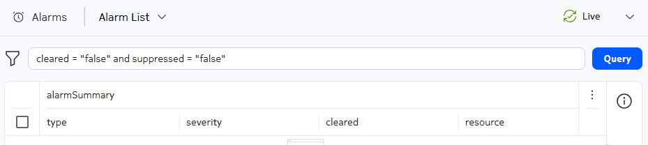
The text input bar supports the EQL where clause syntax. For information about how to use EQL, see Nokia EDA query language
Note
Switching from advanced to basic mode will clear existing filters.
Using the column menu#
For some data grids, when you hover a column heading, a Menu icon displays.
From the column menu, you can select from the following options:
- Sort by ASC and Sort by Desc: sort by ascending and descending order
- pin to the left or to the right
- Filter: click to open a Multiple Filters form where you can create multiple filters.
- group columns by the selected title
- hide the column
-
Manage columns: opens a form where you can do one of the following:
- select the columns to display
- search for a column
- select to show or hide all columns
Switching to raw value for column headings#
By default, the Nokia EDA UI displays user-friendly versions of the field names and values.
For EQL-based data grids such as alarms and resources, you can switch to the raw API field names and values. This is useful when using the UI as reference for API calls and EQL queries.
To switch to raw values, select Show raw values from the Table settings & actions menu.
To return to the UI rendered values, click Show user-friendly values from the Table settings & actions menu.
Common data grid actions#
The following options are available for the menu of Table settings and actions for any table in the Nokia EDA GUI.
- Clear sorting: select to remove all sorting from all columns.
- Clear filters: select to remove all filters from all columns.
- Manage columns: for any table, the displayed columns may be a subset of all available columns. Select this option to view a list of all possible columns, and enable or disable any items.
- Autosize all columns: if you have previously adjusted the width of any column, select this option to restore all columns to their default width.
- Export to CSV: select to save a comma-separated-values (.csv) file containing all data for the currently displayed table. The file is saved to your default download directory.
- Save Column Layout: select to save the column selection and column width for the table on this page. These settings are saved as part of your user account and are retained in future sessions until you change them or reset the column layout.
- Reset Column Layout: select to restore the column layout to the default settings.
Note
In addition to the common actions described above, the list of actions may also include:
- Multi-row actions that can be applied to multiple selected items simultaneously.
- Special actions that are unique to specific types of resources.
- Bulk edits, which allow you to modify multiple selected items in the same way.
Multi-row actions#
Some tables support actions that can be simultaneously applied to all selected rows. When available, these actions are displayed under a sub menu of the Table settings and actions menu.
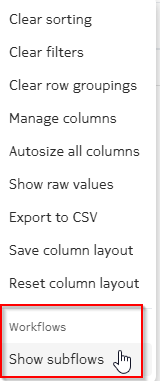
Special actions#
Some tables support special actions appropriate to the particular data displayed in the list. When available, these actions are displayed under a sub menu of the Table settings and actions menu.
Counters#
All resource data grids throughout the Nokia EDA UI contain counters for alarms and deviations. Each of these counters appears as a column in the data grid.
The Alarm column displays the number of active alarms, per severity, that are raised against the specified resource:
- critical
- major
- minor
- warning
For Node resources, the alarm counters include alarms raised against the resource and alarms where the node is listed as an affected target.
The Deviation column displays the number of deviations associated with the specified resource.
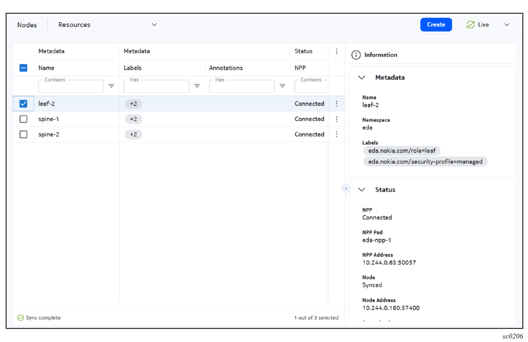
Information panel #
Data grids include an Information panel. You can open this panel by clicking the Expand/Contract control at the middle right of any grid or with the i hotkey.
The Information panel displays information about any selected object on the corresponding grid.
To enhance readability, fields that would contain no information are excluded from the information panel.
Bulk edits #
To aid on those occasions where you need to make the same change to multiple items, some data grids include a Bulk Edit option.
The Bulk Edit option allows you to:
-
Select a set of objects in a list.
-
Configure a set of properties they all share in common to be removed, added, or replaced.
-
Apply those same changes to all of the selected objects (immediately as a commit, or later as part of a transaction).
After you select all of the objects that are the subject of your change (using the check box at the left of each row), selecting the Bulk Edit option from Table settings & actions opens the Bulk Edit page.
The Bulk Edit page indicates the number of objects selected, and lists all of the editable properties those objects share. For each property, a check box allows you to select it for modification.
After an item has been selected for editing, a drop-down control allows you to choose the type of change to make, and a field displays the specific changes you have indicated for that property.
The Selected Items split view button displays the selected items you are making changes to. You can deselect items from this list to exclude them from the bulk edit.
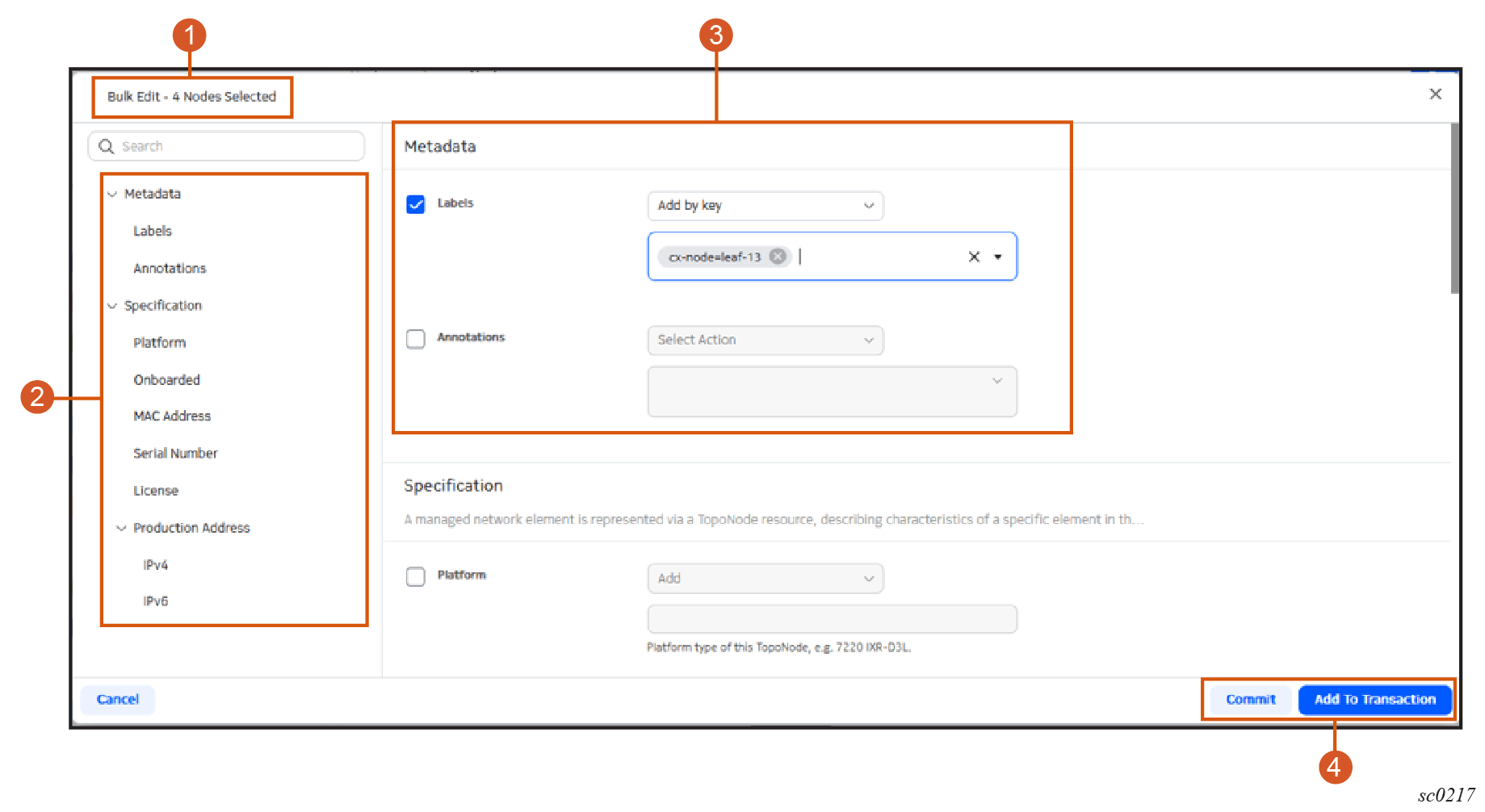
Table: Elements of the Bulk Edit page
| Item | Description |
|---|---|
| 1 | The page name and an indication of the number of selected objects that are subject to these bulk changes after they are committed. |
| 2 | A list of modifiable properties for the selected objects. |
| 3 | In this, case the Labels field is selected for modification. Because the field has been selected for modification, the actions drop-down list is displayed. Available options are specific to the Labels field. |
| 4 | The Selected Items split view displays the selected items and allows you to select or deselect items from the list. This view can be collapsed. |
| 5 | After configuring the set of changes for all parameters, choose from among the standard Commit options for this bulk edit:
|
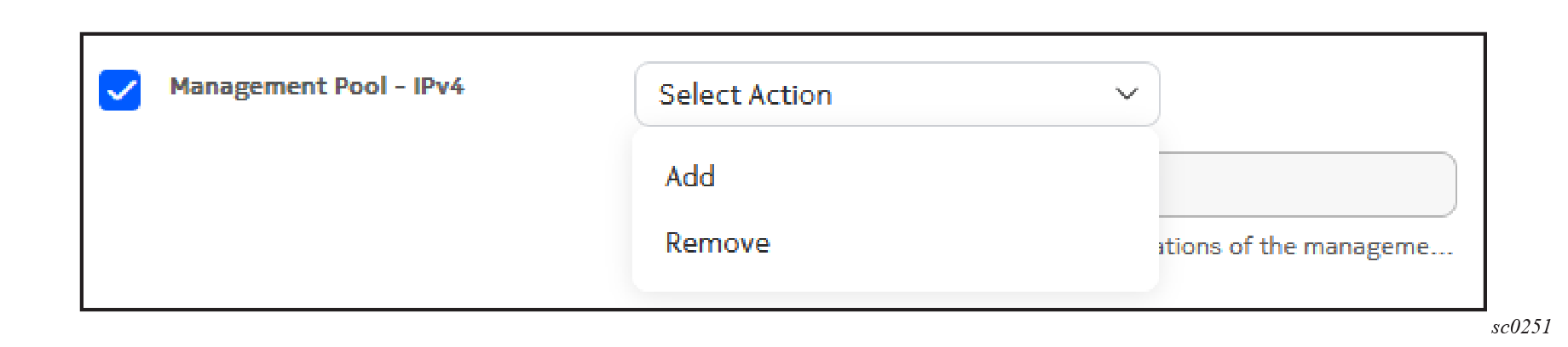
The actions available for a specific parameter as part of a bulk edit depend on the type of data being modified.
Bulk edits for single-value fields#
Single-value fields are those that contain integers, strings, or enums (single selections from a drop-down list).
- Add: the new value supplied as part of the edit is written to the selected field.
- Remove: any current values in the selected field are deleted.
Note
If a field is required, the Remove option is not available.
Bulk edits for maps#
Maps type fields are collections of key-value pairs. Supported bulk edit options can be based on the key, or on the field as a whole.
- Replace all overwrites the current set of objects with the values supplied as part of the edit.
- Remove all removes all objects in the array. This is only available for optional arrays.
- Add by key appends new values supplied as part of the edit to the current set. If a key used in the new values matches that of an existing key-value pair, the existing value is overwritten with the new value.
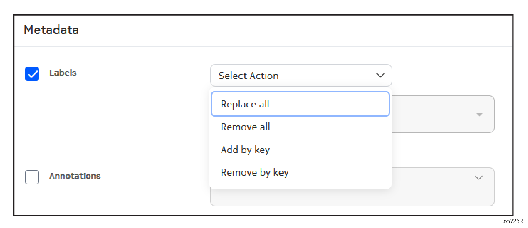
Bulk edits for labels#
Labels are a special case of maps with support for "Remove by key" in addition to the other map actions.
- Replace all overwrites the current set of objects with the values supplied as part of the edit.
- Remove all removes all objects in the array. This is only available for optional arrays.
- Add by key appends new values supplied as part of the edit to the current set. If a key used in the new values matches that of an existing key-value pair, the existing value is overwritten with the new value.
- Remove by key removes objects from the current set that match the specified key.