Topologies#
The Nokia EDA GUI includes a framework for visualizing topology diagrams, and overlaying state information with colors and badges. Topologies and their overlay are created by Nokia EDA apps.
A topology diagram can represent the relationships between any set of data that has a structured relationship. The most common is the 'Physical' topology provided by the Nokia EDA app 'Topologies', illustrating the physical nodes, links, and interfaces managed within Nokia EDA.
The Nokia EDA topologies framework is comprised of 'nodes', 'links', and 'endpoints'. For the physical topology this maps to:
TopoNoderesources are the 'nodes', representing network switches and routers managed by Nokia EDA.- members of the
TopoLinkresources are the 'links', representing physical cables between nodes. - members of the
Interfaceresources are the 'endpoints', representing physical ports of the nodes.
The topology diagram#
In the Nokia EDA GUI, you can view the available topology diagrams by selecting Topologies in Nokia EDA's Main navigation panel. From here the UI displays a list of all topologies installed in the system.
Double-clicking or selecting Show Topology from the actions menu on the Topologies page opens the selected topology diagram.
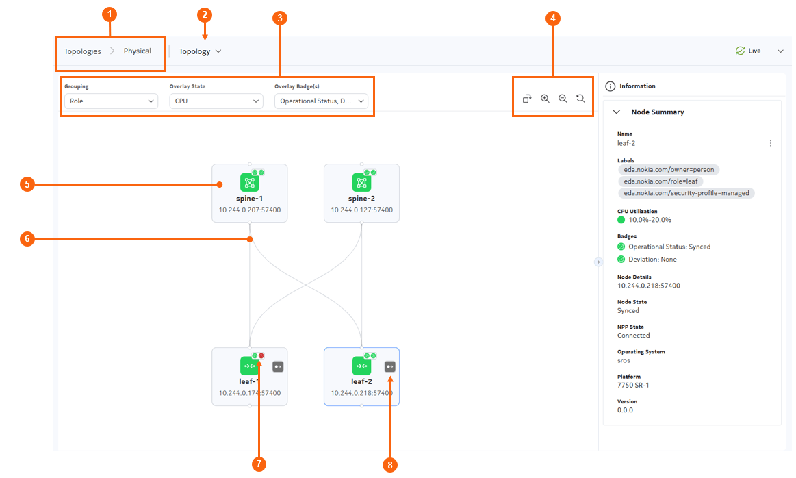
Table: Elements of the topology diagram
| # | Name | Function |
|---|---|---|
| 1 | Topology breadcrumb | Displays the name of the topology currently being displayed. You can click Topologies to return to the Topologies page. |
| 2 | View selector | Click this button to select between a vertical (top to bottom) or horizontal (left to right) display for the topology elements. |
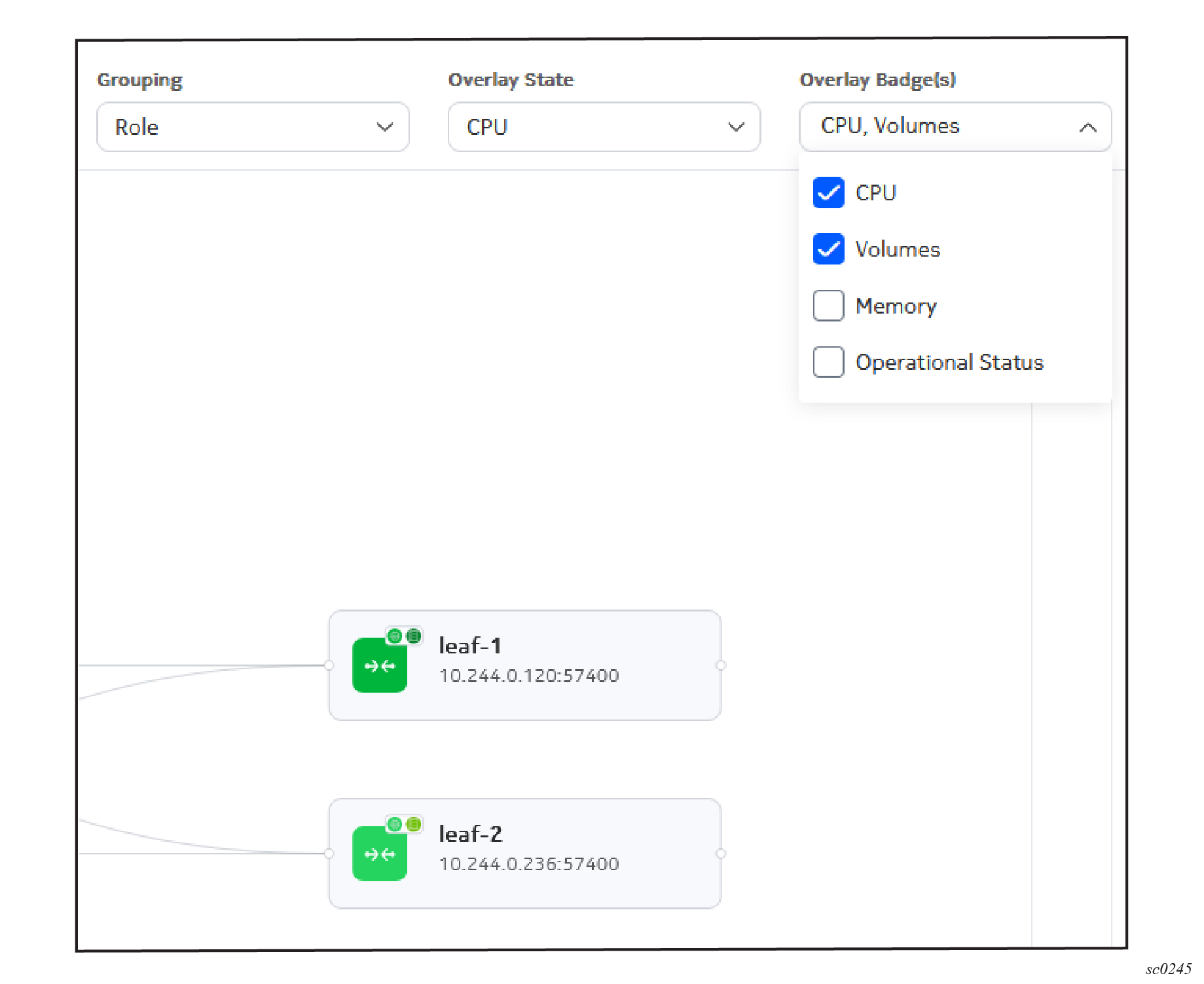
| 3 | Grouping, Overlay, and Badge selectors | Use this drop-down list to:
|
| 4 | Display controls | Allow you control the topology diagram display in the following ways:
|
| 5 | Node | A node within the topology.Click on any node to view details about that node in the Information panel. Right-click on any node to access the action menu for the related resource. |
| 6 | Links | A link within the topology. Click on any link to view details about that link, the connected nodes, and the link endpoints in the Information panel. |
| 7 | Overlay badges | Used to indicate status based on current selections in the Overlay Badge(s) drop-down. |
| 8 | Edge link icon | Indicates the presence of edge links (links with no remote endpoint). When selected, the information panel lists the specific endpoints for that node. |
Overlays#
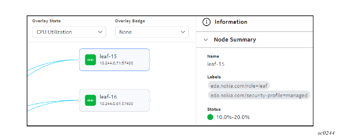
Information can be overlaid on a topology as either a state or as a badge. States shade the nodes, and links of a topology with a color corresponding to the information. For example, The Physical topology Operational Status overlay shades nodes and link green for operationally up, and red for operationally down.
More details about the significance of overlay shading are available in the Information panel for each node.
Overlays may also include state information for topology endpoints. This is not represented in the graph, but is available in the Information panel by selecting the appropriate link or a node's edge link icon.
Here are some of the overlays provided for to the physical topology:
- The CPU utilization overlay shades nodes based on the percentage of CPU capacity that is in use on the node.
- The Memory overlay shades nodes based on the percentage of memory that is in use on the node.
- The Volume overlay shades nodes based on the percentage of disk usage on the node.
- The LLDP overlay shades links based on the discovered peer on each endpoint, and the correlation of this with the configured intent.
- The Operational Status overlay indicates the operational status of each node and link in the topology.
Overlay badges#
Overlay badges are displayed only on nodes within the topology. You can select up to three badges to display simultaneously. Each badge consists of an icon and a color to indicate the related status. Where multiple badges are available and enabled, they display in a series at the upper right of the node image. For example, The Physical topology Alarm overlay displays an alarm severity badge when there are active alarms affecting the node.
More details about the significance of a badge are available in the Information panel for a badged node.
Information panel#
As with many pages in the Nokia EDA GUI, an information panel is available on the right side of the topology illustration. Expand this panel to view detailed information about a selected object within the illustration.
For links, the information panel includes nested summaries for each selected link showing its endpoints. Actions are available through a contextual menu associated with each eligible object.
This can be a useful way to see the specific meaning of overlays shading or badges within the topology illustration.
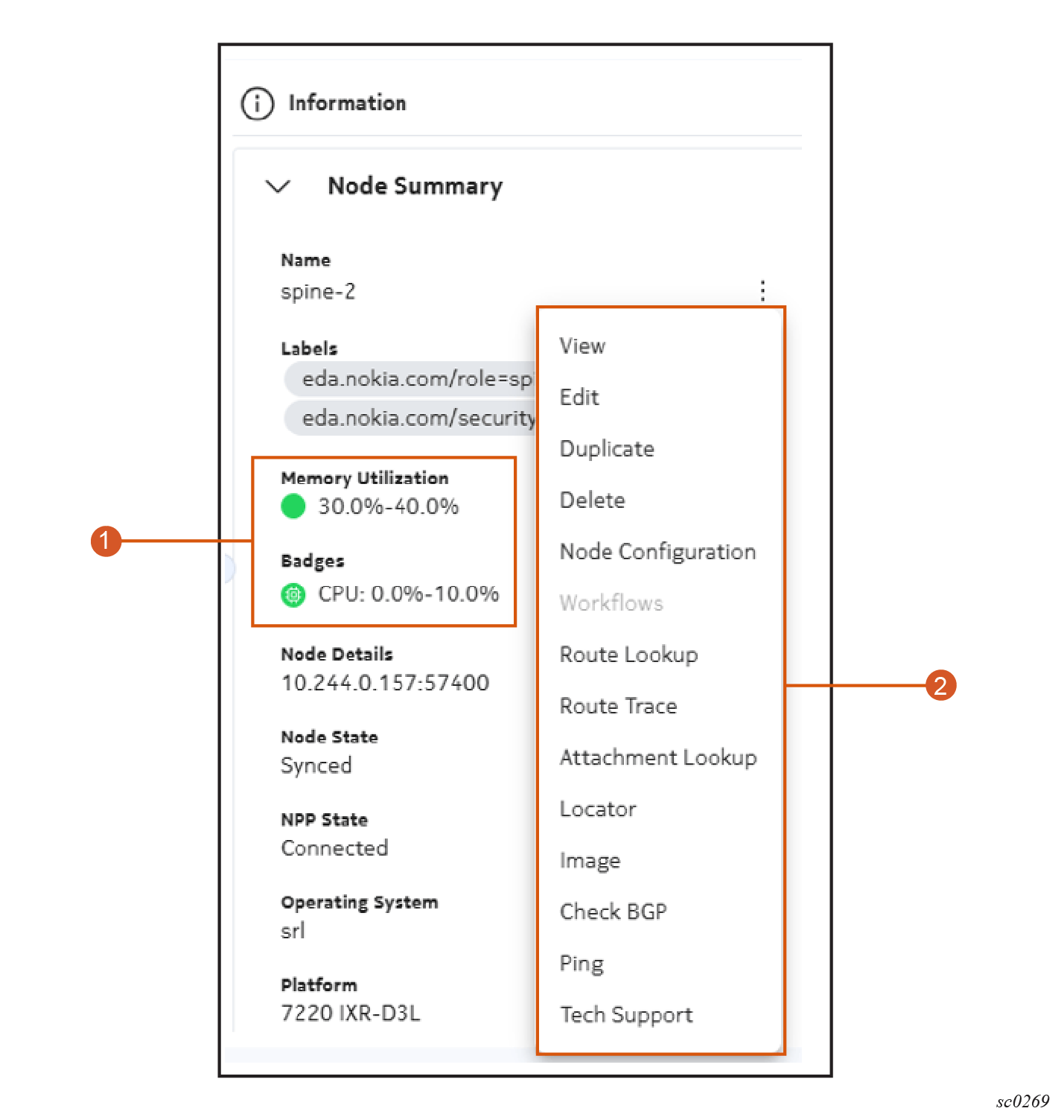
Table: Elements of the node information panel
| # | Name | Function |
|---|---|---|
| 1 | Status indicators | If an overlay or badges are enabled, then the associated overlay or badge names are displayed here along with the current, associated status for the selected nodes. |
| 2 | Actions menu | The conventional menu for node actions is available from the information panel. Actions are applied to the selected node. See the documentation for node management for details about these actions. |
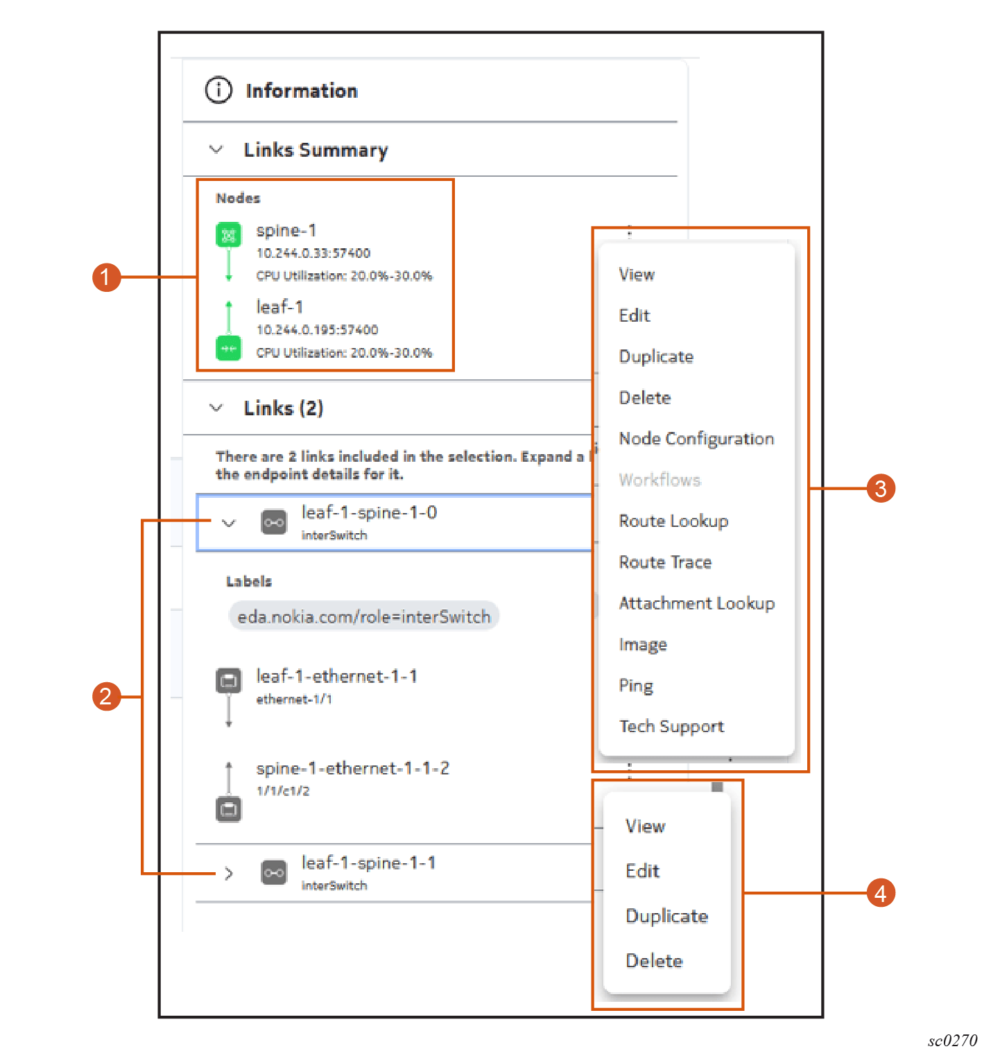
Table: Elements of the link information panel
| # | Name | Function |
|---|---|---|
| 1 | Participating nodes | Nodes at either end of the selected link are identified here. If an overlay is selected, that information is included here as well. |
| 2 | Links | The selected links are listed here. Initially they are collapsed.Expanding any link in the list displays details about its endpoint. |
| 3 | Node actions | A contextual action menu is available for displayed nodes |
| 4 | Link and endpoint actions | A contextual action menu is available for individual links (shown in the illustration) and endpoints (not shown). |
Groupings#
The Grouping selection determines how elements within the topology are arranged within the topology diagram. Groupings use two factors to display the Topology diagram:
- Tiers define the hierarchy of nodes; either left-to-right or top-to-bottom, depending on the user selected orientation.
- Groups define how nodes will be clustered together in the diagram within a tier.
The Physical topology includes one grouping, named Role, by default. When grouped by Role, nodes are tiered based on the following labels:
eda.nokia.com/role=backboneeda.nokia.com/role=superspineeda.nokia.com/role=leafeda.nokia.com/role=borderleaf
Tier selectors#
Each grouping defines a set of tiers that organize nodes into a hierarchy. Tiers are display in the diagram lowest to highest, either left-to-right or top-to-bottom; based on the user selected orientation.
For each tier, label selectors specify which nodes to display and a numerical value establishes its place in the grouping's hierarchy.
For example, the Physical topology Role grouping defines a tier with the value 1 that includes all backbone nodes (nodes with the label eda.nokia.com/role=backbone). It also defines a second tier with the value 2 that includes all super-spine nodes (nodes with label eda.nokia.com/role=superspine), and so on.
Tiers are displayed in the diagram, lowest to highest, either left-to-right or top-to-bottom; depending on the user selected orientation.
Group selectors#
For each grouping you can also define groups based on the presence of certain labels.
For each group, you define one or more label selectors to define the group memebers.
The following example groups spine nodes and leaf nodes within their tier based on the presence of the labels eda.nokia.com/pod=topo1 and eda.nokia.com/pod=topo2.
apiVersion: topologies.eda.nokia.com/v1
kind: TopologyGrouping
metadata:
  name: pod-groups
  namespace: eda-system
spec:
  groupSelectors:
    - group: pod-leafs1
      groupUIName: pod-leafs1
      nodeSelector:
        - eda.nokia.com/pod=topo1
        - eda.nokia.com/role=leaf
    - group: pod-leafs2
      groupUIName: pod-leafs2
      nodeSelector:
        - eda.nokia.com/pod=topo2
        - eda.nokia.com/role=leaf
    - group: pod-spine-1
      groupUIName: pod-spine-1
      nodeSelector:
        - eda.nokia.com/role=spine
        - eda.nokia.com/pod=topo1
    - group: pod-spine-2
      groupUIName: pod-spine-2
      nodeSelector:
        - eda.nokia.com/pod=topo2
        - eda.nokia.com/role=spine
  tierSelectors:
    - nodeSelector:
        - eda.nokia.com/role=leaf
      tier: 4
    - nodeSelector:
        - eda.nokia.com/role=spine
      tier: 3
    - nodeSelector:
        - eda.nokia.com/role=superspine
      tier: 2
Group selectors are optional. The Physical topology default Role grouping does not include any group selectors.
Creating a topology grouping#
You can create or modify groupings to customize the way nodes are displayed in the topology diagram. After you create a custom grouping, it is available for selection in the Grouping dropdown of the topology diagram for all users.
Follow these steps to create a custom topology grouping:
-
Use the Main navigation panel to select Topologies; this opens the Topologies page.
-
Double-click a topology in the list, or use the Table row actions drop-down list to click Show Topology.
The topology diagram displays, showing a graphical representation of the nodes and links within network topology.
-
Use the View drop-down to select Manage Groups; this opens the Group List view.
-
Click Create to display the Topology Grouping form.
-
Set the grouping's Name, Labels, and Annotations fields. If you do not define a UI Name, the Name value you provide here will be displayed for this grouping in the Grouping drop-down list.
-
Optionally, create one or more group selectors:
- In the Group Selectors panel, click Add to open the Group Selectors form.
- On the Group Selectors form, enter the name of a Group to which any node with a label matching these selectors should be assigned.
- Enter a UI name, which is the name for this group that will be displayed in the GUI.
- Click the + icon beside Add a Label Selector, and in the resulting field enter a label-value pair that qualifies a node for inclusion in this group.
- Add more label-value pairs to act as group selectors as required.
- Click Add at the bottom of the Group Selectors form to close it.
-
Add tier selectors to define the criteria by which to sort the group members into a hierarchy:
- In the Tier Selectors panel, click Add to open the Tier Selectors form.
- On the Tier Selectors form, click the + icon beside Add a Label Selector, and in the resulting field enter the name of a label-value pair that qualifies a node for inclusion in this tier.
- Add more label-values pairs to act as tier selectors as required.
- Assign a Tier value to establish this tier's position in the hierarchy for this group. 0 is the highest tier; 1 the next highest; and so on.
- Click Add at the bottom of the Tier Selectors form to close it.
-
Enter the following:
-
a UI Description to be displayed as a description for this grouping in the GUI.
-
a UI Description Key to act as the translation key for the description of the topology grouping in the UI.
-
a UI Name, which if provided replaces Name as the value displayed for this grouping in the Grouping drop-down list.
-
a UI Name Key to act as the translation key for the description of the topology grouping to expose to the UI→
-
-
Click Commit to immediately apply the changes or click Add To Basket to store these changes to be processed later as part of a transaction. Alternatively, select Dry Run to test your changes immediately, and reveal any issues before proceeding.
Managing topology groupings#
Follow these steps to view, edit, duplicate, and delete groupings. These changes are applicable to all users.
-
Use the Main navigation panel to select Topologies; this opens the Topologies page.
-
Double-click a topology in the list, or use the Table row actions drop-down list to click Show Topology.
The topology diagram displays, showing a graphical representation of the nodes and links within network topology.
-
Use the View drop-down to select Manage Groups; this opens the Group List view.
-
Do one of the following:
-
To delete a grouping, do the following:
-
Locate the grouping you want to delete in the list, and use the Table row actions control to select Delete.
-
Respond to the resulting confirmation dialog with either Commit to delete it now, or Add to Basket to add the deletion to the Transactions basket to be part of a future transaction.
-
Go to step 9.
-
-
To view details about one grouping, do the following:
-
Locate the grouping you want to delete in the list, and use the Table row actions control to select View.
This opens the Topology Groupings view for the selected topology. This view shows the outline view, YAML view, and the details for the Grouping including sub-panels to show all of its constituent Group Selectors and Tier Selectors.
-
To view details about any Group Selector or Tier Selector use the Table row actions control to select View.
-
Go to step 9.
-
-
To edit a grouping, do the following:
-
Locate the grouping you want to edit in the list, and use the Table row actions control to select Edit.
This opens the same Topology Grouping page originally used to create the grouping.
-
Modify the grouping as required. The name cannot be altered, but you can add labels and annotations, and add, remove, or modify group selectors and tier selectors along with other properties for this grouping.
-
Click Commit to immediately apply the changes or click Add To Basket to store these changes to be processed later as part of a transaction. Alternatively, select Dry Run to test your changes immediately, and reveal any issues before proceeding.
-
Go to step 9.
-
-
To create a new grouping that uses an existing grouping as a starting point, do the following:
-
Locate the grouping you want to duplicate in the list, and use the Table row actions control to select Duplicate.
This opens the same Topology Grouping page originally used to create the grouping. Group selectors, tier selectors, and other configured properties are retained, but the Name field is blank.
-
Enter a Name for the new grouping.
-
Modify the grouping as required. You can add labels and annotations, and add, remove, or modify group selectors and tier selectors along with other properties for this grouping.
-
Click Commit to immediately apply the changes or click Add To Basket to store these changes to be processed later as part of a transaction. Alternatively, select Dry Run to test your changes immediately, and reveal any issues before proceeding.
-
-
You have completed this procedure.